
Recipe for the CSS Effects
'Polaroid Effect' - Images rotate & zoom upon hover
Comptability: Google Chrome, Internet Explorer 9+, Safari (Firefox does not show alignment properly)
In the HTML, I used a div named 'Polaroids' to contain the images. Each image was placed within the list item of an unordered list. The code looks like this:
<div id="polaroids">
<ul>
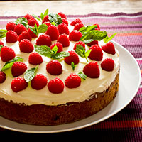
<li><a href="#" title=" cake "><img src="images/cake.jpg" alt="cake" class="rotate-left"></a></li>
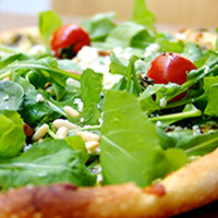
<li><a href="#" title=" pizza "><img src="images/pizza.jpg" alt="pizza" class="rotate-right"></a></li>
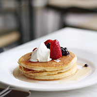
<li><a href="#" title="pancakes"><img src="images/pancakes.jpg" alt="pancakes" class="rotate-left"></a></li>
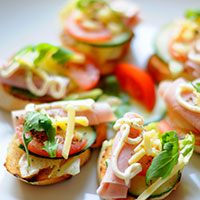
<li><a href="#" title="sandwich"><img src="images/sandwich.jpg" alt="sandwiches" class="rotate-right"></a></li>
<li><a href="#" title="cupcakes"><img src="images/cupcakes.jpg" alt="cupcakes" class="rotate-left"></a></li>
</ul>
</div>
The labels underneath are actually the descriptions used in the title tag called up by CSS code. Note: After much guess and check, it seems one of the only ways to get the titles centered under the images was to ensure that each title had the same number of characters (achieved using the HTML space code).
To get the titles to show up, I used the following code:
#polaroids ul a:after {
	content: attr(title); /* calls up the title tag attribute */
	margin-left: -190px;  /* by default the headings appear to the right of the image, this margin corrects that */
	background: #fff;
	padding-left: 50px;  /* the padding tags center the text under the images /*
	padding-right: 50px;
}
The rest of the code includes spacing fixes, adding the white borders to the images, and CSS transition effects. In the HTML code above, I assigned various classes to each image so that by default, every second image would be rotated in a different direction.
#polaroids img{
	margin-top: 30px;
	margin-bottom: 20px;
	background: #fff;
	padding-top: 10px;
	padding-left: 10px;
	padding-right: 10px;
	padding-bottom: 10px;
	-webkit-box-shadow: 0 3px 6px rgba(0,0,0,.5);  /* this adds a shadow to the images */
	-moz-box-shadow: 0 3px 6px rgba(0,0,0,.5);
	-o-box-transform: 0 3px 6px rgba(0,0,0,.5);
	-ms-box-transform: 0 3px 6px rgba(0,0,0,.5);
    box-shadow: 0 3px 6px rgba(0,0,0,.5);
}
	img.rotate-left{ /* this class rotates the image 3 degrees to the left */
		-webkit-transform: rotate(-3deg);
		-moz-transform: rotate(-3deg);
		-o-transform: rotate(-3deg);
		-ms-transform: rotate(-3deg);
		transform: rotate(-3deg);
	}
	img.rotate-right{ /* this class rotates the image 3 degrees to the right */
		-webkit-transform: rotate(3deg);
		-moz-transform: rotate(3deg);
		-o-transform: rotate(3deg);
		-ms-transform: rotate(3deg);
		transform: rotate(3deg);
	}
	a:hover img{ /* when the image is hovered over, the following will occur */
		-webkit-transform: scale(1.05); /* brings the image closer by 1.05 */
  		-moz-transform: scale(1.05);
		-o-transform: scale(1.05);
		-ms-transform: scale(1.05);
		transform: scale(1.05);
  		position: relative;
  		z-index: 5;
  		-webkit-box-shadow: 0 3px 6px rgba(0,0,0,.5);
  		-moz-box-shadow: 0 3px 6px rgba(0,0,0,.5);
	}
#polaroids li{
			float: left; /* ensures that the unordered list is vertical */
			margin-right: 10px;
			margin-left: 10px;
}
	#polaroids ul a{
		text-decoration: none;
		color: black;
	}